
Updated February 13, 2024
Does your website rely heavily on color to help your visitors navigate your content? If the answer is yes, then you might be making it impossible for the 1 in 12 men and the 1 in 200 women with color-blindness and color vision deficiency (CVD) to engage with it.
No one is intentionally making websites hard to navigate, and luckily there are some straightforward fixes to improve your website’s color accessibility. But first, it’s important to understand what we mean by color accessibility and the impact it has on your visitors.
What is color blindness accessibility in website design?
When it comes to web design, making your website accessible for people with color-blindness is all about ensuring that everyone can use and enjoy your site, even if they can’t see the full range of colors. Things like the colors you use for text and backgrounds, how saturated they are, what kind of patterns you’re using, and even the size and contrast of your text can make all the difference.
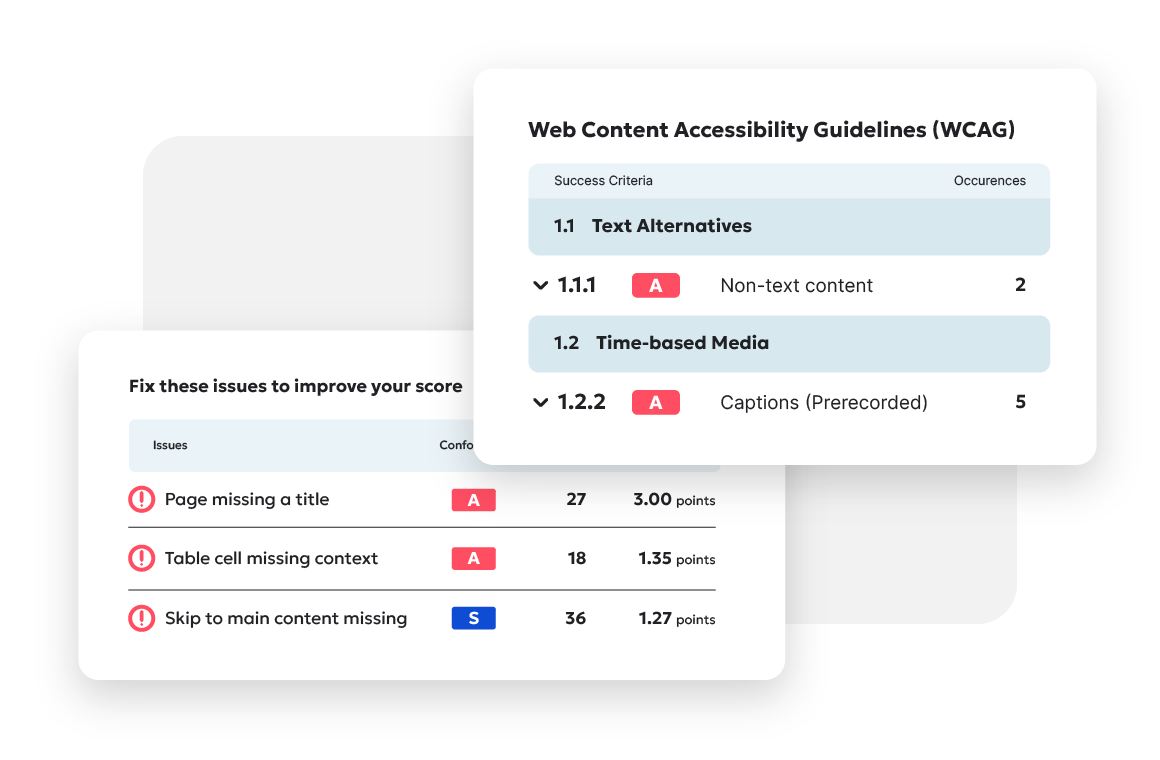
Color accessibility is measured by how well your website follows the guidelines set by Web Content Accessibility Guidelines (WCAG), which make sure there’s a standard for things like how clear your text is against the background (depending on the font size); these standards apply to everything from the words on your site to how things like forms, checkboxes, and logos are displayed.
In a nutshell: All your visitors should be able to navigate and understand your content with ease.
The advantages of designing a color-accessible website
Besides the obvious benefits to color-blind visitors, there are other benefits to an accessible website. For one, there’s a misconception that accessibility only benefits people with disabilities, when actually the design principles behind accessibility come down to making digital content easier to use. Even if a visitor isn’t color-blind, a clear visual language that guides visitors to the intended outcome is really the ultimate goal of web design.

Think about the last time you visited a web page that used black text on a dark navy background, or distracting colors, patterns, or effects that made it hard to find what you were looking for. Did you push through, or did you give up and find what you needed somewhere else? Did you visit other pages on the site? How long did it take?
Likely you’ve experienced this frustration, so it’s easy to understand how color accessibility can boost user experience for anyone and help retain visitors on your website. A smoother website experience means less frustration, happier visitors, and lower bounce rates.
Color accessibility is also core to sound design, in pretty much any context. “Many designers think the accessibility color standards are limiting, but it comes down to good design principles,” says Christina Adams, Siteimprove’s digital accessibility manager.
“Many designers think the accessibility color standards are limiting, but it comes down to good design principles.” - Christina Adams, Digital Accessibility Manager at Siteimprove
And not to sound alarmist, but it’s hard to ignore the very real possibility of legal implications if you don’t follow the standards Accessibility laws around the world are tightening up — including the Americans with Disabilities Act (ADA) and the European Accessibility Act — and lawsuits against inaccessible websites are on the rise, with a 74 percent increase in the number of lawsuits between 2018 and 2022. (Fun fact: the majority of those suits are against ecommerce companies.)
Even large companies like Amazon, Walmart, and CVS have faced accessibility lawsuits in recent years; Amazon has been hit with two suits from individuals with vision disabilities.
You can protect your business against similar lawsuits and settlements by taking steps to remove barriers to access.
When designing your website, start with an understanding of the types of color-blindness
Color-blindness encompasses a whole range of visual abilities. For instance, someone with difficulty distinguishing colors might also have other visual impairments like near-sightedness, far-sightedness, or sensitivity to light.
Each person’s needs can vary, so what works for one visitor with limited sight might not be enough for another.
Monochromacy
Monochromacy, a condition where a person can’t see colors — only black, white, and shades of grey — is a broad term covering two conditions: Achromatopsia (rod monochromacy), where someone can’t see color because of missing or inert retinal cones, is very rare and often accompanied by light sensitivity or near/far-sightedness; and cone monochromacy, where people can’t see color but have generally normal vision otherwise.
Tritanopia
Tritanopia is a form of color-blindness where a person can’t tell the difference between blue and yellow. People with tritanopia can still perceive red and green hues.
Deuteranopia
People with deuteranopia can’t distinguish among hues of greens, making it one subtype of what’s commonly called “red-green color-blindness.” Deuteranopes can exhibit a nearly complete blindness to green or a lack of sensitivity to green hues (known as deuteranomaly). It’s estimated that about 1 percent of males and 0.1 percent of females have deuteranopia.
Protanopia
Protanopia is a condition where people can’t distinguish red hues, and it’s the other subtype of red-green color-blindness. About 0.02 percent of females and 1.01 percent of males have some form of protanopia.
How to make your website more accessible to color blind users
First, don’t use accessibility overlays — automated tools that claim to find and fix accessibility issues — on your website, however tempting that may be. As we explain in this blog post, they’re just a band-aid solution that covers the problems. And remember the rise in lawsuits we mentioned? Accessibility overlays and widgets are frequently listed as barriers in ADA claims.
So, rather than going with the quick and unreliable fix, start with an audit of your site’s accessibility and use color contrast checkers to test your website.
We get how overwhelming it is to wrap your head around WCAG, so to get you started, you can focus on these six website elements:
- Elements with low color contrast can be indistinguishable to someone without a full range of color sensitivity. Images, videos, GIFs, charts, graphs, and other visuals that might otherwise give your website some panache can exclude some visitors for the same reason.
- Text readability is vital to creating a web page everyone can understand. Everything about the text on your website, from your choice of typeface and font to style and size, can make it hard to read. Modifiers like italicization, bolding, kerning, spacing, serifs, and more can improve or ruin the user experience for visitors of any ability level.
- Text overlays on images aren’t discernible to all visitors. Whether it’s live text or baked into the image file, words on a picture are almost always competing for attention with the content of the image.
- In-text hyperlinks can be completely missed by a color-blind visitor. Some site styles don’t make it clear that text contains a link, and some only change color when a visitor hovers over them with their mouse pointer, which isn’t enough for color-blind visitors.
- Errors, issues, and warnings can’t rely only on color. For example: If a visitor misses a field when filling out a website form, clicks “submit,” and the field’s text or outline changes from black to red, that’s not enough to show them something’s wrong or how to fix it.
- Form placeholders with low color contrast might just look like text. The same rules that govern on-page text (size, color contrast ratio, etc.) apply to the text that appears in forms before someone clicks on them. Websites must make it clear to all users, with strong color contrast and other non-text elements, that a form is intended to be typed in or responded to.
Also, consider prioritizing the places on a site that are highly informative or engaging for users. “Focusing on making these places easy to use with accessible design gives us the engagement we’re asking for from our users,” says Christina.
No website is perfect, but it's important to recognize that accessibility is not a one-off project but more of a journey. And taking the first steps of that journey is better than not taking them at all.
And who knows? As our experts explain in one of our recent webinars, an accessible website might be a critical business driver you’re overlooking.
Ready to create more accessible and inclusive web content?
Siteimprove Accessibility can help you create an inclusive digital presence for all.
Request a demo
Chris Schafer
Chris is a former Content Strategy Manager at Siteimprove where he created unique content as a member of Siteimprove's internal creative studio.