Quality Assurance (QA) is one of Siteimprove’s most enduringly popular tools. So, we were surprised to discover that some of our customers aren’t using Siteimprove QA to its full potential. If you are only using QA to fix broken links and misspellings, you could be missing out on achieving a high-quality site that provides an excellent user experience and establishes you as a trustworthy brand online.
Website quality now means much more than just catching spelling mistakes. That’s why we’ve put together this detailed guide on how to move beyond fixing broken links and get more out of QA’s ‘hidden’ features.
First, let’s discover why website quality is such a big deal.
Why website quality matters
As websites continue to grow in size, complexity, and reputation, so too does the importance of content quality. Today, there are more contributors publishing more content in more languages than ever before. Dispersed teams with hundreds of contributors create, edit, and manage hundreds or even thousands of web pages. It’s no surprise that errors and mistakes happen – the real problem is when those issues go undetected and are uncovered by a site’s users first.
These errors have the power to damage an organization’s integrity, brand reputation, and in a worst-case scenario, their bottom line. Once a user has seen an error, or experienced a dissatisfying visit, the damage has been done. In fact, 88% of online consumers are less likely to return to a site after a negative experience.
That’s where a website quality assurance tool comes in. Using Siteimprove QA helps you deliver the excellent digital experience your users expect by ensuring they don’t catch site errors before you do.
Let’s take a closer look at how our QA tool achieves this.
Understanding how your QA Score works
Your QA Score is a measure of the credibility and usability of the user-facing parts of your site. It is determined by your site’s performance in four categories:
- Content quality: The editorial quality of a site's content, which affects how quickly and accurately users can comprehend it.
- Content freshness: How up-to-date a site's content is. This affects user retention, engagement, and impacts a site's SEO rankings.
- Security: How vigilant a site has been in only linking to safe domains, and in keeping users' personal information private.
- User experience: How helpful content is to the smooth navigation of a site.
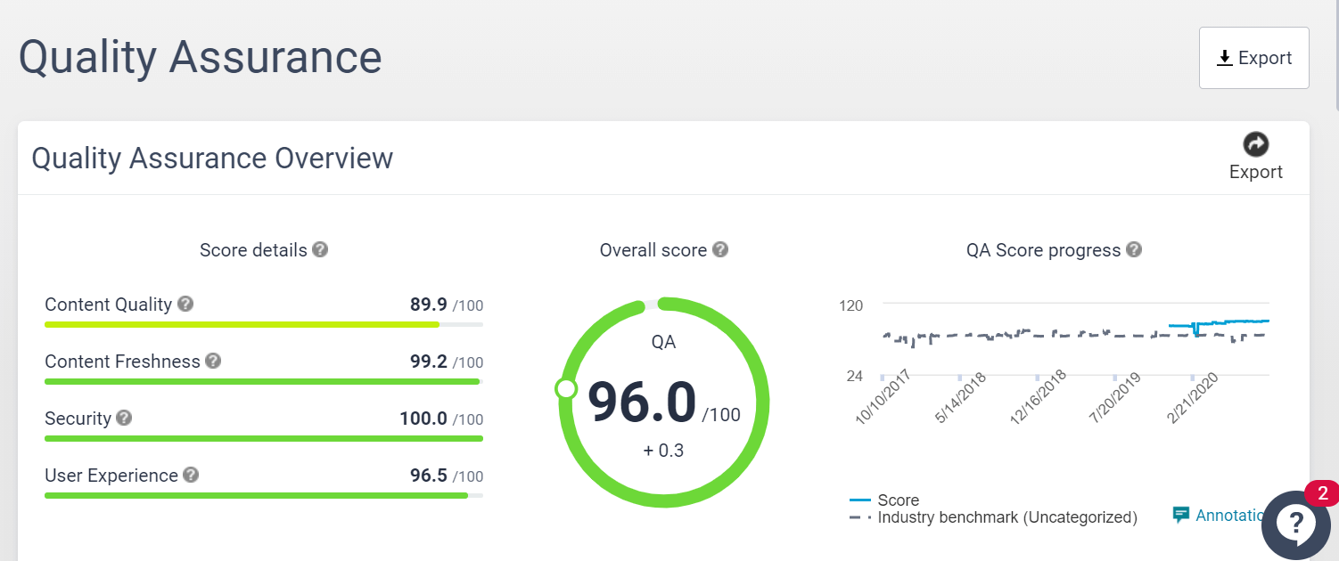
Improving your QA Score is relatively straightforward: work your way through the ‘Fix These Issues to Improve Your Score’ list to send your score skywards. To help you prioritize, the issues are listed in order of the impact they will have on your final score.
For a full breakdown of your QA Score head to ‘Quality Assurance Score Breakdown’.
To get an overview of what quality improvements you’ve accomplished on your website – and the impact it had on your QA Score – head to the ‘Fixed Issues’ section.
Tip: The Industry Benchmark feature shows you had well your site performs compared to the industry average for quality assurance.
Next, we’ll recap three of the most popular features on Siteimprove QA.
The big three website quality killers: Broken links, misspellings, and poor readability
1. Broken Links
Few errors are more certain to deliver a frustrating and unprofessional user experience than broken links. Broken links create credibility issues, and your visitors may question the reliability and quality of your site’s content if they get a “sorry, page not found” message. They’re also more likely to abandon your site. In fact, 79% of users who don’t find what they’re looking for on one site, will continue searching on other – potentially your competitors’ – sites.
And that’s not all. Broken links are also bad for SEO. While a small number of broken links won’t hurt your search engine rankings, search engine crawlers do abandon pages with broken links. Fixing broken links makes it easier for search engines to crawl your site for more complete indexing.
What causes broken links?
- Deleting an image, video, file, or a web page
- Mistyping a URL
- Renaming or moving a page and not updating your internal links
- Linking to external content that has been deleted or moved
- Changing domain names
QA’s Broken Links Finder is the all-time most popular feature on Siteimprove QA. It simplifies keeping on top of your link health by identifying internal and external broken links across your site, before your users stumble across them. Tight on time? You can prioritize fixing broken links based on user-visibility insights such as the number of page views, page level, and clicks.
How should I use it? Click into the relevant ‘Page Report’ to pinpoint exactly where a broken link sits on any given page, then head to your CMS editing environment to address the issue and publish the change.
Tip: The Links Summary feature provides an overview of your progress against link issues on your site. Check out the Trends Graph to check the status of links on your site – it is updated after every sitecrawl.
2. Misspellings
60% of marketers create at least one piece of content each day. With such massive amounts of content being produced it’s inevitable that some spelling errors will slip through the net.
How costly are these spelling mistakes for organizations? According to one study, extremely! U.S. businesses with bad grammar and spelling mistakes on their sites experienced an 85% higher bounce rate when compared to sites with no errors. The study also found that time on site was reduced by 8% for landing pages with misspellings.
How should I use it? Clearly, it’s important to ensure that a user’s first impressions of your site aren’t of a sloppy company. So, to locate misspellings on your site, head to the ‘Spelling’ section of QA. From here you can see confirmed misspellings on your site, review potential misspellings, and approve words that aren’t problematic.
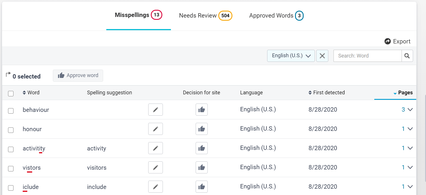
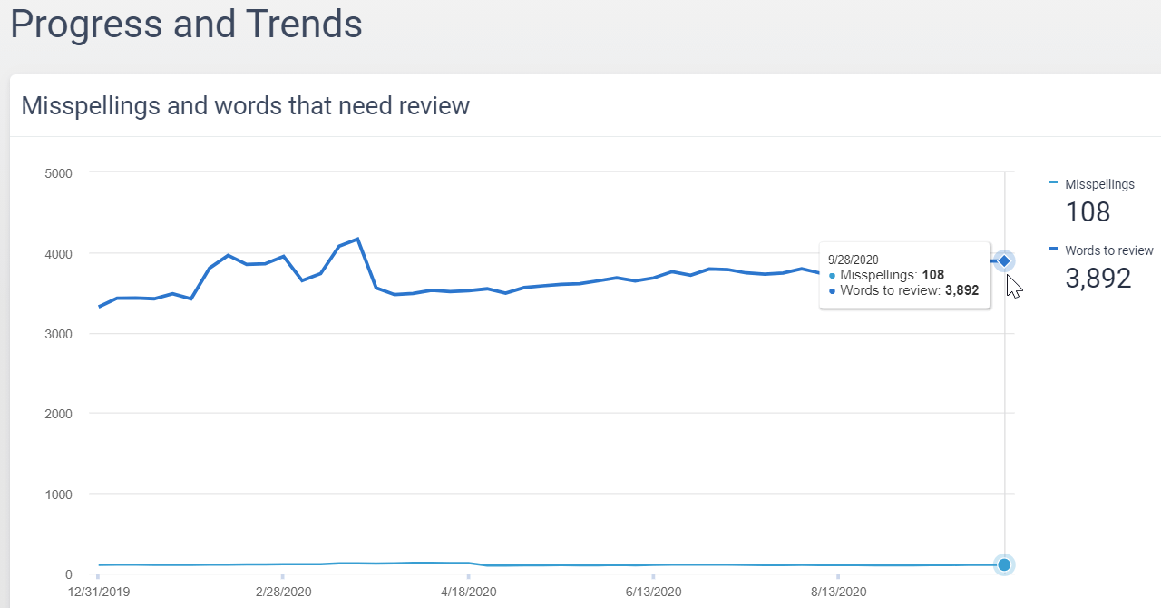
It’s then a simple process of fixing misspellings directly in your CMS by clicking on the CMS button. You can keep track of your words to review and progress in eradicating misspellings in Spelling’s ‘Progress and Trends’ feature.
QA’s spellcheck feature is available for multiple languages, making it easier to address misspellings in the internet’s most popular languages. In the ‘Progress and Trends’ tab you can view a breakdown of your pages by language, making it easier to assign misspellings to content teams for different regions.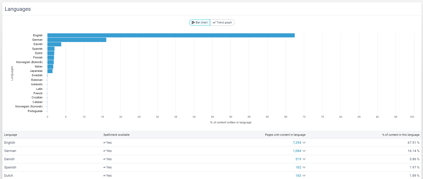
Tip: Approved words won’t be marked as misspellings. This is useful if you want to avoid having names, addresses, and brand/trademark names flagged as words to review.
3. Readability
Content that your users easily understand helps them achieve their purpose on your site quickly and effectively – whether that’s making a purchase, logging into their account, or locating an answer to a question they have. This is known as having good readability.
Readability is all about how easy (or hard) it is for a user to understand your website’s content. It is determined by factors including vocabulary, characters, word length, and sentence length. With just 16% of visitors reading a web page word by word, creating readable content is essential for effectively sharing your message online. If your content is hard to understand, your visitors are more likely to bounce off the page and never return.
In the US, the average reading grade level is seventh-eighth grade – that’s to say, 11-13 year-olds. But different groups will have different reading and comprehension requirements – that’s where QA Readability comes into play.
How should I use it? QA Readability highlights readability barriers by testing the reading level of your website copy. Different readability levels apply to different audiences, so QA offers you the chance to select from seven globally recognized readability tests to benchmark your content against.
What readability tests can I choose from?
- Automated Readability Index
- Coleman-Liau
- Flesch-Kincaid Grade Level
- Flesch-Kincaid Reading Ease
- Gunning Fog
- LIX
- SMOG
Read more about how these readability tests work in our Help Center article.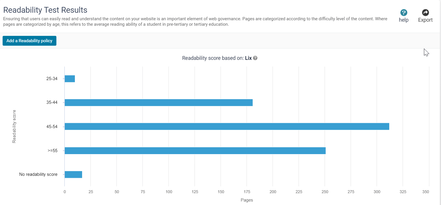
Use your readability test results to transform dense, confusing copy into easy-to-read, compelling content. Remember, readability is one the most undervalued components of any website. Thrity-eight percent of users will stop visiting a website if they find its content unappealing, so make sure you stay competitive by speaking in a language that your visitors can relate to.
Tip: Use the 'Excluded Pages' feature to intentionally bypass certain pages in your readability tests. This is useful for pages that are written with a specific audience in mind, or are full of more complex terms, like terms and conditions.
Now we’ve covered the ‘big three’ of website content quality, let’s turn to Siteimprove QA’s less-known features. If your aim is to deliver the highest-quality site experience, you should be diving into these ‘hidden’ features too.
What are QA’s ‘hidden’ features?
Deliver a secure site experience with Unsafe Domains
A secure site does not link to unsafe domains. That means being vigilant about removing links from your site to domains that contain phishing, malware, or encourage users to install unwanted software. QA’s Links to Unsafe Domains feature makes identifying risky domains easier.
That’s important because if a user clicks through to a risky domain from your site, it could negatively affect your site’s trustworthiness. With 85% of consumers saying they won’t engage with a business if they have concerns about its security practices, it’s clear that providing a secure and confidential site experience is essential for delivering a good user experience.
How should I use it? Siteimprove QA’s Unsafe Domains feature identifies and highlights external links to unsafe domains on your site. Here’s how you can find it.
- Select Quality Assurance from the main menu.
- Expand the Links menu
- From the drop-down select Links to Unsafe Domains
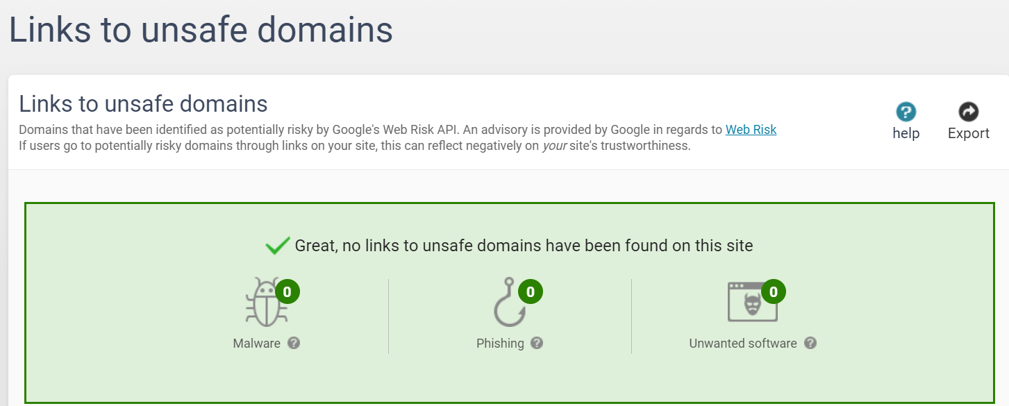
From here you will see a list of potentially unsafe domains on your site. QA bases this decision on Google’s register of potentially unsafe domains. Links to these domains are highlighted on the page report and PDF document report. To ensure your security, and the security of your site’s users, you should delete these unsafe domains from the affected page in your CMS.
Tip: Keep track of unsafe domains on your site by adding them as a component of your Quality Assurance reports.
Speed up your site with Image Size
Website quality isn’t just about words. Images also matter. Images larger than 1MB slow down your site speed, which results in a poor user experience.Slow-loading websites are actually responsible for $2.6bn revenue loss each year. Let that one sink in for a moment.
To make sure your images contribute to a fast site – and to even increase your conversion rate by 7%, it’s important to regularly scan your site for image optimization opportunities.
How should I use it? QA records a list of site images that exceed the 1MB limit. To access it:
- Select Quality Assurance from the main menu.
- Expand the Inventory menu
- From the drop-down select Media Files > Images
- Change file size to ‘Above 1MB’
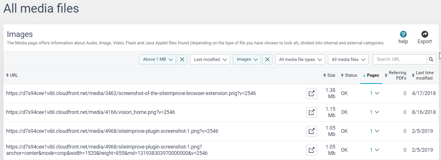
With the offending images identified, the next step is to cut them down to a more user-friendly size. Siteimprove Performance expert Viktor Petersson advises you to do the following:
“Generally, there is no reason for an image file to be larger than 1MB. Anything bigger can noticeably slow page load. Resize images before loading them into the browser. If your image will end up at 200x300px, the original file should match those dimensions. This will considerably shorten image load time and help the speed of the page overall.”
Ensure documents are accessible to all with Document Usability
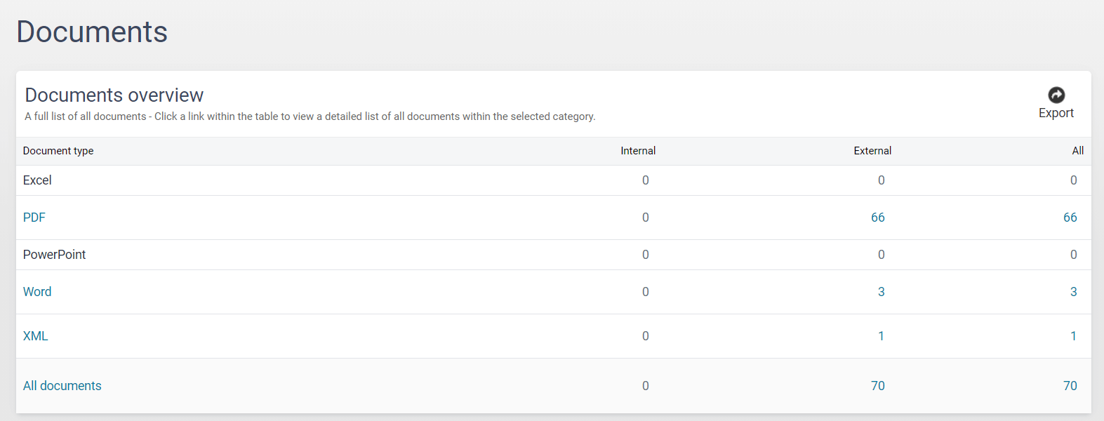
Did you know that using document types other than PDFs and XML can make that content inaccessible to some users? That's because the usability of closed-format documents like Word, Excel, and PowerPoint is limited to users who have the programs to open them, for example, Microsoft Office. If you have closed-format documents on your site, it will lower your overall QA Score.
How should I use it? Anything that interrupts the smooth navigation of your site provides a poor user experience, so it’s important to track down these files and replace them with more user-friendly alternatives. To uncover these files on your site, navigate to the ‘Inventory’ drop-down in QA, and from there select ‘Documents’. Here, you’ll be able to see a full list of documents on your site split by document type.
Divide and conquer quality assurance checks with Groups
The Groups feature is used to display QA information for specific sections of your site. Groups are useful if multiple editors are responsible for different areas of a site.
How should I use it? On large websites, it’s likely different contributors will be responsible for creating content for and policing the quality of different areas of your site, for example, blogs, news, product pages, and customer service.
Using the Groups feature, you can group pages together using a URL match, for example, /news/:
- site.com/news/2016
- site.com/news/2017/article
- site.com/news/latest
Then the person who look after the "News" content on the website could easily view and get reports for the pages they have responsibility for. They can then start working their way through the QA issues present on their Group’s pages.
Review new content in seconds with Single Page Check
When you publish new content to your site, you may want to check it immediately for errors. It doesn’t always make sense to wait for a full sitecrawl to review the results.
The Single Page Check feature makes this a non-issue by letting you submit individual URLs to be checked on the spot – giving you results for a specific page in minutes.

How should I use it? Simply paste in the URL for the page you want to check, then hit ‘Check Page’. From here, you can click on the page title to open its page report. The page report then makes it simple to identify errors by highlighting them directly on the page.
Spot the difference with Check History
QA’s Check History feature provides information for each report that was sent at the end of a full sitecrawl.
How should I use it? Check History is useful for detecting decreases and increases in page counts and link counts. It includes the link count, number of broken links, misspellings, and page count.
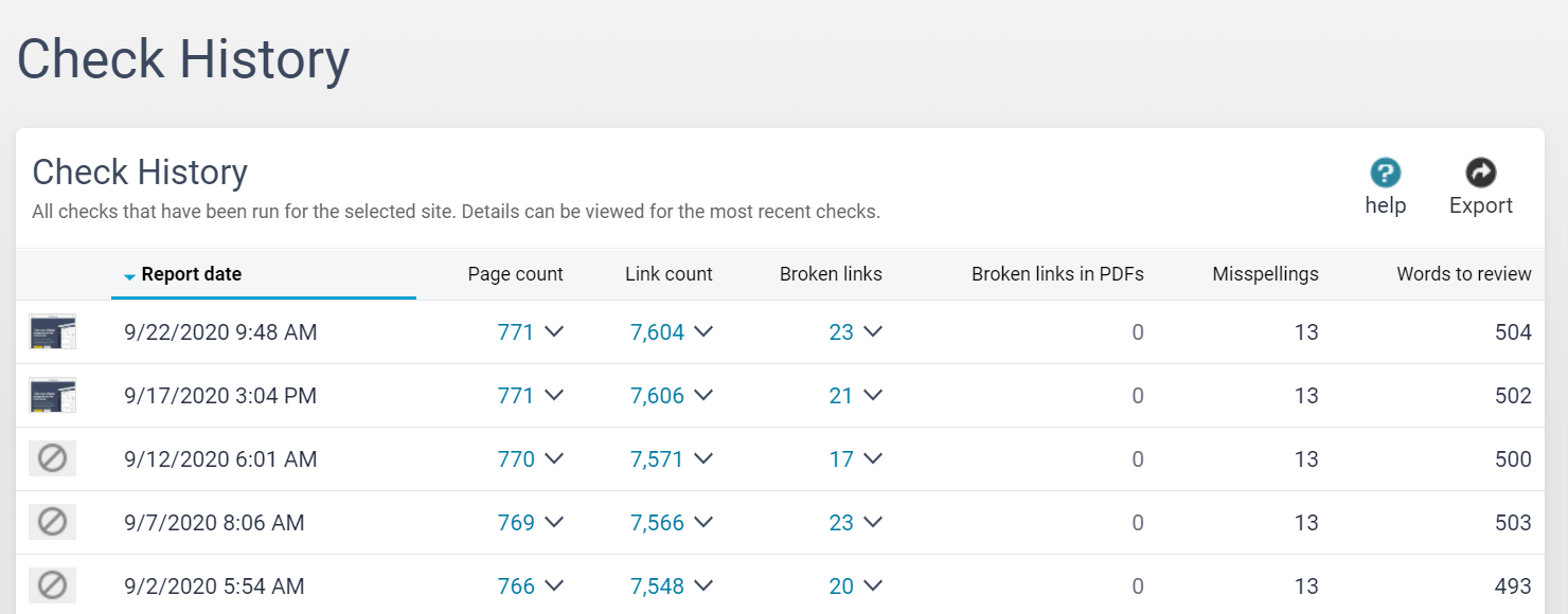
Using Check History, you can see:
Page count:
- Known pages: Pages that have been seen during the previous report crawl and that have also been seen during this report crawl.
- New pages: New pages seen during this report crawl.
- Removed pages: Pages that were seen on the previous report crawl but not seen on this crawl.
Link count:
- Known links: Links that we have seen during the previous report crawl and that have also been seen during this report crawl.
- New links: New links seen during this report crawl.
- Removed links: Links that were on the previous report but are not seen on this crawl.
Update outdated pages and files with Content Freshness
How up-to-date a site's content is affects both user retention and engagement. It also impacts a site's SEO rankings. Siteimprove QA measures content freshness based on two criteria:
- New pages are frequently added
- Documents and media files are frequently updated
How should I use it? This is how to check your site for outdated files with QA:
- Expand the Inventory menu in QA
- From the drop-down select Media Files
- Filter by Last Modified
Now, it’s time to update or remove any irrelevant and outdated content that no longer provides a good user experience.
Banish ‘click here’ hyperlinks from your pages with Link Text
To help users scan your pages and quickly locate the information that they need, your clickable link text, also known as anchor text, should:
- Stand out visually from the surrounding text
- Clearly and accurately describe the page it takes the user to – the target page
That means finding and replacing generic or vague sounding link text like ‘click here’ or ‘more’ with descriptive links. For customers who use a screen reader, multiple instances of ‘here’ link text on a single page can hinder their comprehension of your content.
Google also uses your anchor text to understand what your pages are about, and for which keywords they should rank.
Rather than writing something like:
Learn more, here, here, and here.
Try to make the links descriptive, so your users will know what they’ll see before they click on a link. For example:
Read more about Siteimprove’s products, Accessibility and Quality Assurance.
It's also good practice to use the same link text when linking to the same destination page.
How should I use it? Open the Inventory drop down menu, then navigate to the ‘Link Text’ feature. In this section of QA, you can see and review all your website’s link text in one place.
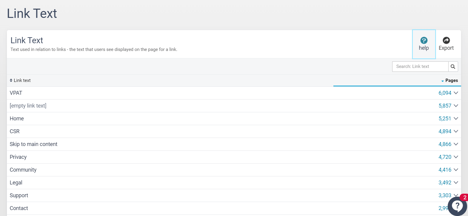
Expand the ‘Pages’ column to view all pages on your site where the link text has been used. Using this functionality, you can locate every instance of bad link text, such as ‘click here’. Check the URL it leads to and replace it with a user-friendly alternative.
A high-quality website experience is about more than broken links
As your online presence grows, monitoring your expanding library of content and protecting your brand’s digital reputation becomes a bigger and more complicated task. It’s worth remembering that aggrieved users typically don’t complain – 91% just disappear without leaving feedback, never to return. Make sure that isn’t your website by using Siteimprove QA to proactively find and fix errors and weaknesses in your content before your customers do.
Questions about Siteimprove Quality Assurance?
At Siteimprove we’re always looking for ways to help our customers work better, faster, and smarter – and that means ensuring you always get the most out of Siteimprove QA. Our Customer Success Managers are always happy to help you get more value from your favorite Siteimprove tool.
Georgia James
Georgia James is a freelance writer weaving words into compelling narratives. With a passion for marketing, she crafts engaging content that informs and inspires.
