When it comes to championing and implementing digital inclusion, one of the most common – and biggest – mistakes made by organizations is approaching it as a quick-fix project with a set start and end date, instead of incorporating accessibility into their website processes.
Risks involved with relegating web accessibility to a one-off fix include providing a poor user experience, a loss in revenue, deterring prospective customers, and even fines or lawsuits.
What is digital inclusion?
Digital inclusion is the act of making the web and other digital technologies barrier-free for everyone who wants to use them. While it also has a broader meaning, your digital inclusion strategy should begin with web accessibility. An accessible website means it’s usable by everyone. That’s to say that all your website visitors should enjoy equal experiences on your website; whether that’s being able to purchase an item, download information, or submit a request.
The optimal way to create a truly inclusive digital experience for all your site visitors is to integrate accessibility directly into your design and development process on an ongoing basis, rather than applying it as an afterthought.
Why web accessibility is a process – not a project
The misconception that accessibility can be ‘added’ onto a website afterwards as a one-off project is one of the key reasons why the accessibility of a website deteriorates over time. It’s also responsible for many websites that claim to be accessible – but aren’t.
Accessibility and the principles of inclusive design should be baked into every organization as an ongoing process. Yet many organizations are opting to add it in afterwards, often with more thought given over to ticking compliance boxes than the actual user experience. This sometimes ends in unintended and even disastrous consequences for both the organization and its website users. At the least, it’s likely to result in website content and features that are less effective for disabled visitors, and it can even cause additional costs if you need to circle back and make changes further on in the process, for example, needing to go back and remediate hundreds of lengthy PDF files that are inaccessible and contain vital information for your customers.
Often, when accessibility is approached in this manner, the first time accessibility issues come to light is during the quality assurance or user acceptance phase of a web project – or even after a launch has taken place. By this point, complex accessibility problems might require a complete overhaul of the work already completed.

Whether they work with code, content, or design, adding accessibility best practices into their work before and while they do it, rather than doing an ‘accessibility check’ afterwards, means your team can complete their projects more quickly, effectively, within budget, and genuinely accessibly.
The advantages of incorporating inclusive design principles from the start
Making inclusive design a principle of your web design and development processes is the ethical thing to do – but it also has other benefits.
- Designing with the user experience in mind, including accessibility, creates a better user experience for all users, not just those with disabilities. When aligned with your other marketing initiatives, it can have a positive knock-on impact, especially for your search engine optimization efforts, as inclusive design practices, such as adding alt text to images, fast loading times, and a logical navigation are positively recognized by search engines like Google
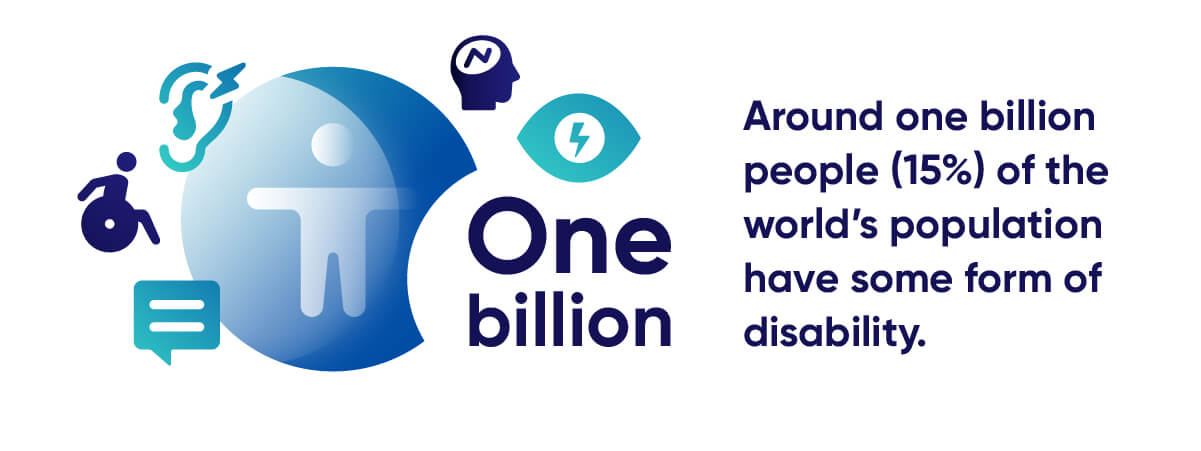
- Accessible sites have a broader target audience. In the US, the Centers for Disease Control and Prevention reports (CDC) reports that 61 million adult Americans live with some form of disability. On a larger scale, around one billion people (15%) of the world’s population have some form of disability.
- An accessible website can become a brand differentiator that increases your competitive advantage.
- By placing inclusive design at the heart of your workflows, you create a more efficient and less expensive website process as issues are identified and solved earlier on, preferably before they’re already live.
- It reduces your legal risk by helping you comply with national accessibility legislation – properly. Learn more about the drawbacks of quick-fix accessibly solutions below.

Accessibility overlays aren’t the answer. Here’s why.
While the benefits are many and tangible, there’s no two ways around it: working towards web accessibility takes a considerable amount of time and effort. This only increases with the size and complexity of a website.
To fill this market need, companies that promise to make a website accessible using a quick-fix overlay or accessibility widget have emerged onto the accessibility scene. These solutions promise to ‘fix’ your site’s accessibility immediately, with minimal effort (often with just a single line of code inserted), and instantly be in full compliance with legislation like the Americans with Disabilities Act (ADA), Section 508 of the Rehabilitation Act, the European Web Accessibility Directive, and Web Content Accessibility Guidelines (WCAG). Plus, there’s no need to do the hard work – like adding accessibility into website workflows or remediate your site’s code. What’s not to like?
Unfortunately, the legal and technical issues surrounding overlays are serious and manifold. At the core of the problem, is the fact that overlays don’t actually create true, long-lasting accessibility on a site. They’ve been known to create new accessibility issues for a site because of conflicts with assistive technologies, like screen readers. On top of that, the moment an organization stops using the overlay vendor, their site’s ‘accessibility’ vanishes.
Even more damagingly, organizations who invest in an overlay solution with the goal of avoiding lawsuits often aren’t getting the level of protection they thought they signed up for. In 2020, around 100 companies received lawsuits after investing in a widget or overlay, with some of these lawsuits even listing widget features as an extra burden for disabled website users.
How to properly incorporate accessibility into your website process
Make no mistake about it: web accessibility is never ‘done’. So, don’t fall into the trap of thinking of it as a one-off project. Any changes to your content or code could introduce new accessibility issues onto your website and harm the user experience.
Now we understand why web accessibility can never be a limited project, it’s time to learn the best ways to work towards it effectively and efficiently. Here’s how to place inclusive design at the center of your website processes and workflows.
Use an automated accessibility checker to routinely scan your website for errors
A trusted accessibility partner that offers automated and manual accessibility services, like Siteimprove Accessibility, can make digital accessibility easier to understand, implement, and crucially – maintain.
Every accessibility initiative – both ongoing and for newcomers to digital inclusion – should begin with an audit of your site’s accessibility status. It’s highly advisable to use a tool that scans for compliance with the most commonly-used global accessibility standard: WCAG.
Accessibility audits help you:
- Detect accessibility errors on your website
- Help assign tasks and responsibilities to the right teams
- Set a baseline against which your accessibility progress can be measured
- Benchmark your site against others in your industry
Regularly auditing a website with thousands – or even tens of thousands – of pages can be daunting, not to mention time-consuming. Fortunately, automated accessibility tools can simplify and speed up this process by simultaneously auditing thousands of pages. They’re also designed to fit into your regular website maintenance, design, and development processes.
One of Siteimprove’s customers, First Tech Federal Credit Union, explained how incorporating automated accessibility testing into their development process enabled them to catch accessibility issues before their redesigned site launched.

Tip: Look out for an accessibility tool with a PDF-scanning feature. To provide a truly inclusive digital experience, all your content, including multimedia files and PDFs, need to be accessible.
Add manual testing into your processes
While many accessibility issues can be detected using an automated accessibility tool, some require human assessment or verification. These issues often involve keyboard-only commands, compatibility with various assistive technologies, and coordination with color-adjustment plugins for web browsers.
That doesn’t mean you need to hire an external consultant or agency to handle them – though in some cases, especially with large, complex websites, using an accessibility expert or partner trained in manual accessibility testing is the right decision. For smaller, simpler checks, automated tools like Siteimprove Accessibility help identify issues which need a manual check to confirm conformance with WCAG and present in-tool tips guide your team on how to resolve them step-by-step, such as checking how descriptive a page title is.
Double-checking your automated testing results and uncovering issues that can’t be found by an automated tool are two good reasons to add manual testing into your design and development processes. Some accessibility blockers which can only be detected manually include:
- Presence of informative page titles: Manual testing checks page titles are unique, meaningful, and concise.
- Option to skip navigation: Manual testing ensures that the option to skip repeated navigational elements is present and correct.
- HTML5 and WAI-ARIA elements: These aren’t errors that need to be fixed but are a best practice for digital accessibility. Manual testing makes sure they are being used correctly.
Just as automated accessibility scanning should be conducted on a regular basis, manual accessibility testing should also be a routine part of your website maintenance processes.
Train your team on accessibility best practices
Accessibility shouldn’t be limited to just one team – and especially not to a single individual. When all your website stakeholders have a sound understanding of digital inclusivity, your website, and by extension, your customers, will benefit.
Accessibility isn’t just for developers – and your team needs to know that. This means creating a culture of digital inclusion around your website. From those leading the charge, down to the people implementing the changes that will ensure your site remains accessible over time. That might include content writers who should be wary of including phrases like ‘click here’, social media managers who should extend accessibility to your social platforms, development teams who need to build a user-friendly code, visual designers who must go beyond simply creating images that have sufficient color contrast, UX designers, and so on.
Again, this is an area where an accessibility partner can help. With the assistance of an automated tool, you don’t need to be an accessibility expert to understand accessibility guidelines. It’s a good idea to use an accessibility tool that helps you to adhere to WCAG guidelines. Look out for tools that offer accessibility courses and training, self-help resources, along with explanations and actionable guidelines for comprehending and resolving accessibility errors on your site – preferably based on WCAG.
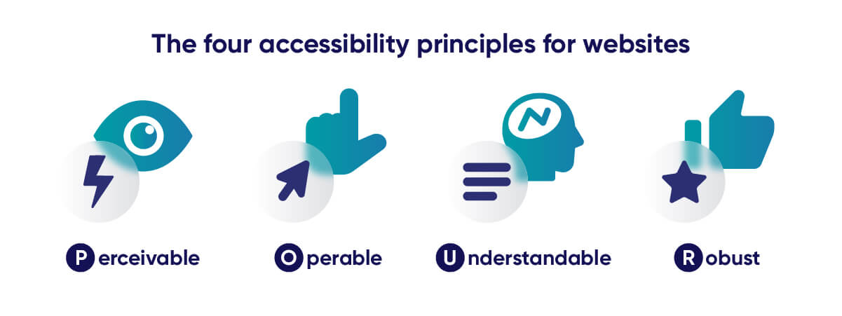
By learning and implementing best practices around web accessibility, you are also more likely to avoid future accessibility violations. The gold standard when it comes to inclusive design best practice is WCAG. For those who will be working with your website in a comprehensive way, such as developers, it’s a good idea for them to familiarize themselves with WCAG. For your wider team, they should at least know the four accessibility principles for websites.

- Perceivable: The information on your website should be presented to users in a way that can be easily perceived. This means ensuring that your text is easily readable, that your multimedia components have alternatives, and that your web design is clear and responsive.
- Operable: All the components of your website and your user interface should be easy-to-use with a variety of tools. The interface should not require any interaction that a user with disabilities cannot perform, for example, single-mode inputs, complex interactive elements, or timed elements.
- Understandable: The information presented on your site should be easily understandable to all users. This means designing simple processes, increasing the predictability of various on-site actions, and offering input assistance for users.
- Robust: Your website should be able to be dependably interpreted by a wide variety of users, including those using assistive technologies.
The University of California, Santa Barbara (UCSB) shared this story about their approach to organization-wide digital inclusion education:
“We are committed to training staff and faculty at UCSB to create accessible content and accessible systems. Accessibility is part of our process when building websites and applications. We like to help each unit when moving to the new UC Santa Barbara branding, to take that opportunity to learn more about accessibility and how to utilize Siteimprove to improve their site’s user experience, content quality, and search engine optimization. We do this by offering both individual and group training, as well as a place to ask questions within our campus community. We heavily promote accessibility awareness, including working on a new campus accessibility policy, multiple workshops during the year, as well as promoting Global Accessibility Awareness Day.”
Tip: Crafting an organization-wide accessibility policy is a good way to get everyone on-board with your accessibility initiatives. It should include your objectives, how you’ll achieve them, and specify who employees can raise accessibility questions and concerns with. This policy should also be reflected in your design and style guides. Together, these documents form the backbone of your accessibility infrastructure that will guide your website processes.
Assign accessibility roles using ARRM framework
Once we recognize that accessibility is more than a quick-fix, it becomes clear that a structured process is needed to manage it properly on an on-going basis.
True digital inclusion is a collaborative effort between all your website contributors; designers, social media managers, developers, content writers, management, and others too. But trying to work towards web accessibility without a guiding framework is likely to lead to a number of problems that can hinder or even torpedo your accessibility efforts, including:
- Uncertainty over roles and requirements
- Lack of communication or teamwork
- No ownership over what needs to be done
- Conflicting interpretations of accessibility requirements
- Competing priorities
To help bring clarity to who needs to be doing what, how, and when, there needs to be a clear structure in place. Helpfully, the World Wide Consortium (W3C) has developed a tool to do just that: the Accessibility Roles and Responsibilities Mapping (ARRM) framework.
ARRM defines accessibility responsibilities and tasks based on role. In essence, it adds structure to your accessibility processes, increases accessibility knowledge sharing, and reduces inefficiencies.
You can learn more about how to use ARRM to work towards web accessibility in this blog post.
Include people with disabilities in your processes
Accessibility is about more than mere legal compliance. It should also make sure your website is inclusive to disabled people. That’s why your usability testing should also include the people who you’re trying to make your website inclusive for – people living with disabilities.
Taking the time to understand how disabled people use websites can be revealing and help you design a website around their actual, rather than perceived, needs. And this goes beyond blind users. You should also consider people with other disabilities that might impede their ability to freely use the web. That includes people with cognitive disabilities, temporary disabilities, like a broken arm, and even age-related disabilities.
Including disabled people might include hiring people who can bring an authentic point of view when it comes to disability to the table, especially in design and development roles. It’s a good idea to combine this with early-stage user research; meaning you include a diverse range of people in your user outreach and testing to provide insights that can help shape your website development.
Track your accessibility progress over time
Tracking and documenting your progress towards web accessibility is important for measuring your level of compliance, spotting areas where more inclusive design best practices could be implemented and helping to keep your team motivated and on-track.
Some accessibility tools assist you with progress monitoring by listing resolved accessibility issues. Look for tools with performance dashboards, reporting capabilities, and goal-setting features.
Web accessibility is never ‘done’
Web accessibility can never be effortless, or will it ever be ‘finished’ on your website. But nor does it have to be all-encompassing, unwieldy, or difficult.
Too many organizations think about accessibility in terms of attaining a certain, legal level of accessibility compliance, such as level AA of WCAG conformance. While this is a good starting point, it should not be your end goal. Instead, it can serve as a starting point to think more broadly and progressively about providing a website experience that really includes all users.
Remember; while compliance with accessibility guidelines and legislation is a valid reason for pursuing digital accessibility, an authentic commitment to digital inclusion is not only the right thig to do – it also enhances your brand reputation and can extend your market reach. And the only way to achieve this is by putting inclusive design and development best practice at the center of your website processes.
Don’t know where to start with accessibility?
If digital accessibility sounds overwhelming to you, then a good place to start is by getting an overview of where your site stands. Use our free website accessibility checker to see where you’re doing well and where there’s room for improvement.
Georgia James
Georgia James is a freelance writer weaving words into compelling narratives. With a passion for marketing, she crafts engaging content that informs and inspires.

